The Brief
Terry and Susan Korsiak were looking for a new image for their Land Use Planning company, Korsiak & Co. Their logo and colour scheme (blue & green) had been around for 15 years, since the company’s inception, and it had become stale and dated. It was time for a change. The focus was to create a logo with more depth and movement, with a graphic element that related to planning / engineering, and a built in tagline to explain what the company did. I was contacted by the design firm, Bare Bones Marketing, for the design of this project.
The Approach
Using fresh colours and a more modern design aesthetic I created a new logo that better represented the company, and what they provided for their clients.

The Result
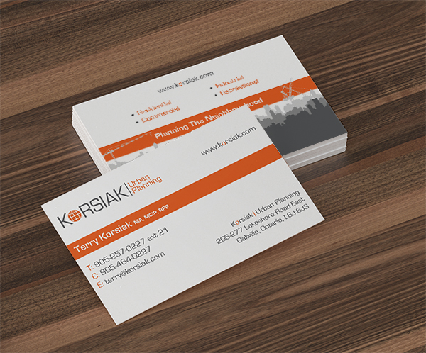
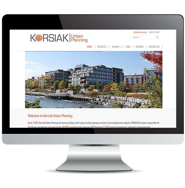
Korsiak & Co. were very pleased with their new logo, and ended up doing an entire rebranding of their company from business cards and postcards to a completely new website.

Testimonials
“Heather, this is great work on the Korsiak materials! I love the colours you chose and all the different pieces you’ve created fit so well together.” Suzanne Lynch, Bare Bones Marketing
“We love our new logo. It’s strong, clean, and bold. We also really liked the colour combination you suggested. It’s perfect, thanks!”Susan Korsiak, Korsiak & Co
“Wow! What an improvement! The new website looks great.”Terry Korsiak, Korsiak & Co

